Media Kit and Guidelines
Grab our official brand resources and learn about usage guidelines.
Download Logo Pack
Get the most up-to-date versions of our logo files for use on social media, print, and the web.
Logo Background Colors
In the Logo Pack we have several variations of the logo that can be used over a variety of background colors.
- Use the standard logo on white, or light-colored, backgrounds.
- Use the "on dark background" version over black, or dark-colored, backgrounds.
- Alternatively there are black, white, and grayscale single-color versions of the logo for special cases. Please select the version that provides the best visibility.
Spacing & Scale
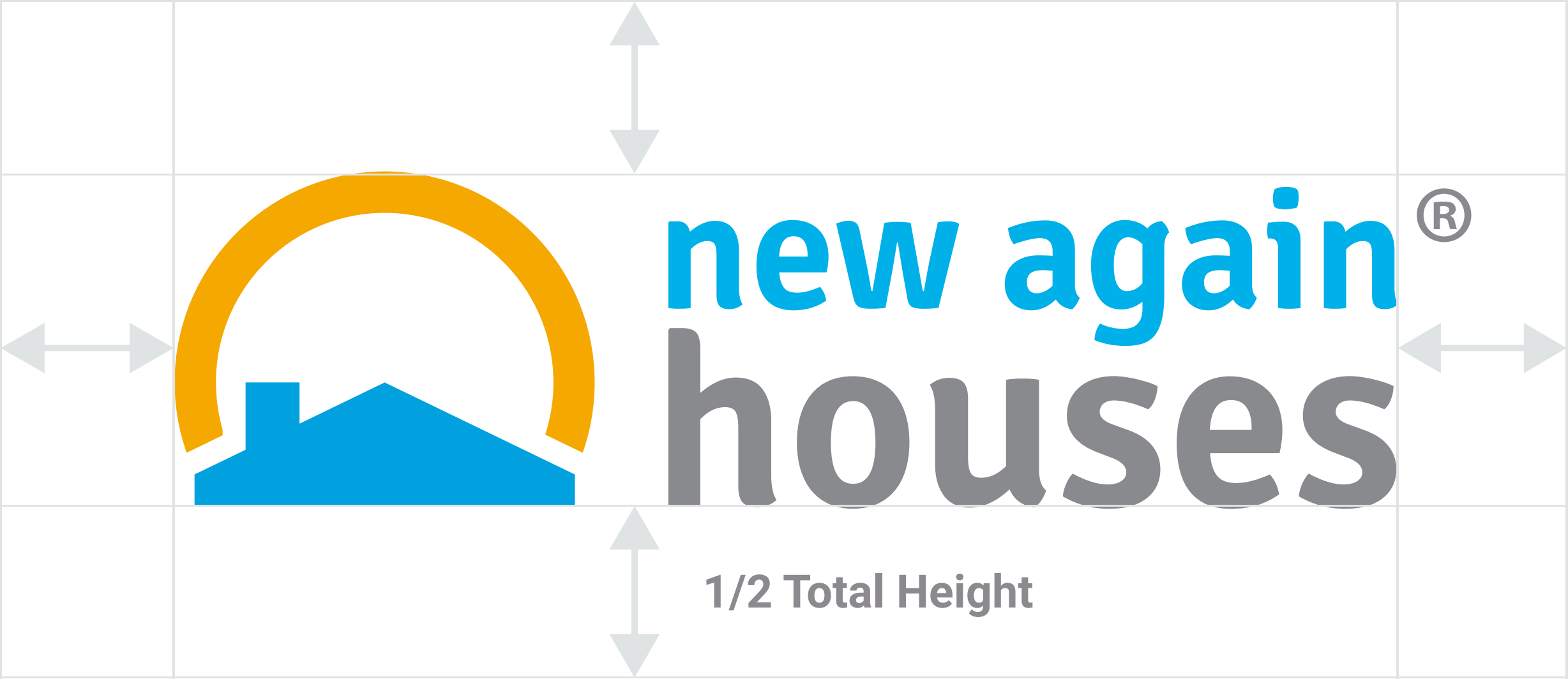
The area surrounding the new identity should maintain a space of at least one-half of the total height of the entire logo in negative space around the logo at all times. This prevents any other design elements from becoming confused with the mark and type or from being mistaken as part of the intended identity.

Incorrect Logo Usage
Consistency and quality are important to our brand. Please do not make any modifications to the logo such as adding text effects, drop shadows, etc.

Do not rotate the logo

Do not skew or distort the logo

Do not add drop shadows

Do not use colors outside of our color palette

Do not resize elements

Do not rearrange the logo
Brand Colors
While our brand colors are easily described as "blue, orange, and gray", in order to maintain consistency and professionalism please use only these specific color codes. Do not choose alternative blues, oranges, or grays.
Blue
Hex: #00a0df |
Yellow
Hex: #f5a800 |
Gray
Hex: #898a8d |
||||||
| 75% | 50% | 25% | 75% | 50% | 25% | 75% | 50% | 25% |
Social Media & Profile Images
It is a common mistake for our logo to appear vertically off-centered when uploaded to social media accounts or similar profiles.
The easiest way to avoid this is to use the Social Media "circle logo" from our logo pack.

![]()

![]()
Fonts
We use a combination of two fonts as our "company fonts". Please refrain from using anything besides these.
Signika
Signika is commonly used for headers and shorter amounts of text displayed at larger sizes.
Download here:
https://fonts.google.com/specimen/Signika
OPQRSTUVWXYZ
0123456789!?#%&$*{(/|\)}
Roboto
Roboto is commonly used for paragraphs and larger amounts of text displayed at medium- to smaller-sizes.
Download here:
https://fonts.google.com/specimen/Roboto?query=roboto
OPQRSTUVWXYZ
0123456789!?#%&$*{(/|\)}